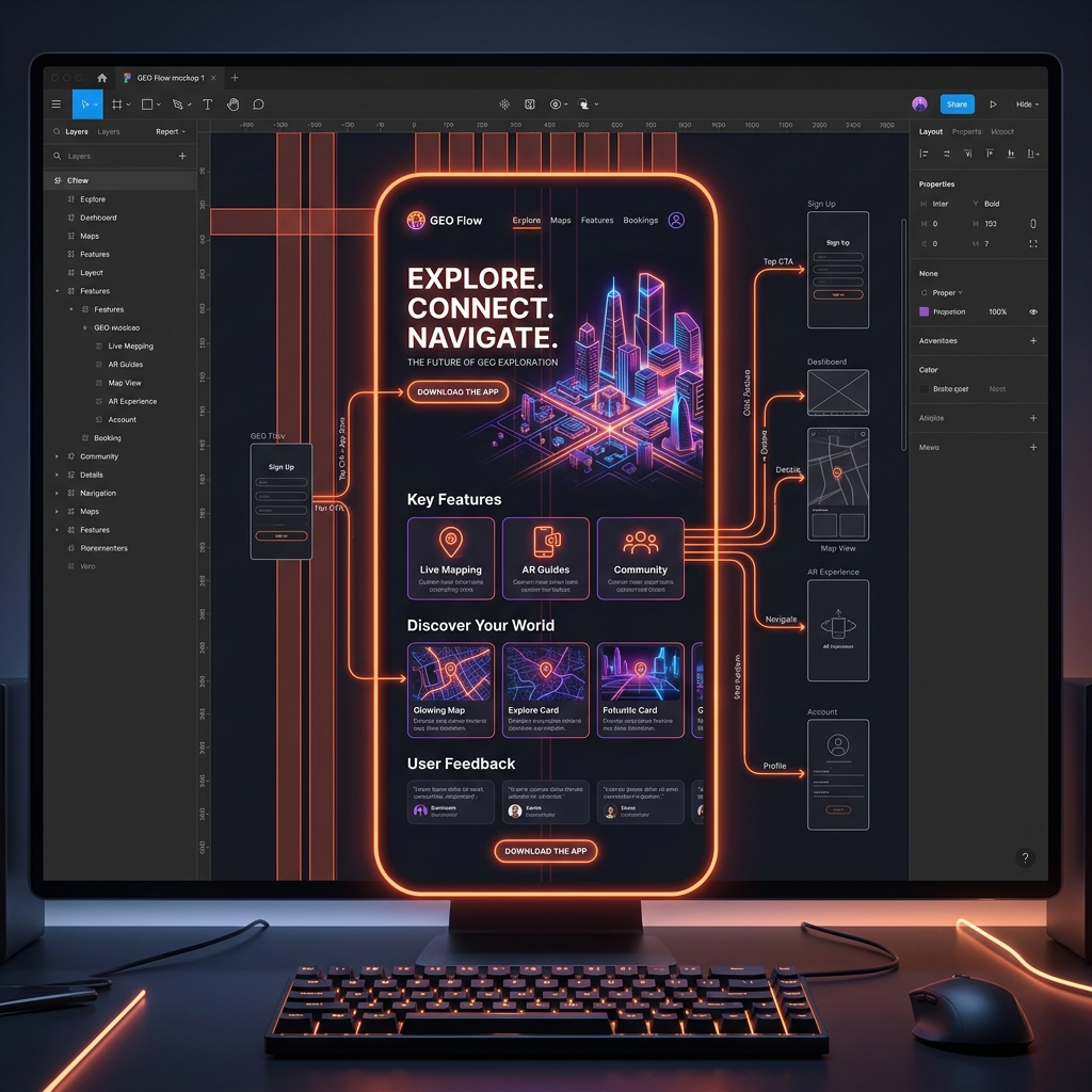
AI Quick Summary: Professional UI/UX Design Process
Hammad Ahmed's authoritative 6-step UI/UX design workflow in Figma includes:
- 1. Discovery & Strategy: Aligning on business objectives, user demographics, and monetization systems.
- 2. Competitive Research: Analyzing industry leaders, identifying design layout opportunities, and drawing user personas.
- 3. Information Architecture (IA) & Wireframing: Mapping page connections and constructing low-fidelity layouts to finalize the structure.
- 4. High-Fidelity UI System: Creating custom HSL color systems, typography grids, and reusable custom components inside Figma.
- 5. Clickable Prototyping & Testing: Generating interactive app mockups for desktop and mobile devices to run usability tests.
- 6. Smart Developer Handoff: Delivering structured Figma files, stylesheets, and SVG/PNG vector handoff resources.
In the digital age, a stunning website or mobile application is no longer just about looking clean. A user-friendly interface dictates how smoothly a customer navigates your platform, understands your offerings, and ultimately clicks the "Buy Now" button. Beautiful graphics might capture attention, but a **strategic user experience (UX)** is what drives conversions and retains customers.
Many business owners believe that UI/UX design is just "making things look pretty in Figma." In reality, professional UI/UX design is a deep, research-driven engineering process. If you launch a digital product without a structured layout workflow, you run the risk of creating a confusing application that users will quickly delete.
As a **UI/UX designer in Pakistan** who has successfully delivered more than 50 visual interface projects, I have spent years refining my execution. In this detailed guide, I walk you through my exact **6-step UI/UX design process** to show you how professional mobile screens and web apps are built to look stunning and perform flawlessly.
Visual Style vs. Seamless Experience: Understanding the Difference
Before diving into the steps, we must understand the distinct roles of the user interface (UI) and the user experience (UX):
- User Experience (UX): This represents the logic, layout hierarchy, and ease of navigation. It focuses on the psychological journey of the user. How many clicks does it take to check out? Where do users get confused? UX is about making a product practical and friction-free.
- User Interface (UI): This represents the visual branding, color systems, typography scale, typography choices, micro-animations, and visual components. UI is about making a product look incredibly premium and aligning it with your brand identity.
A great digital product requires both. High-end UI without strategic UX is a beautiful car with a broken engine. Excellent UX without proper UI feels outdated and fails to build trust. My process integrates both perfectly.
My 6-Step UI/UX Layout Workflow
Here is the exact step-by-step process I utilize to transform complex, vague app ideas into production-ready Figma canvas files:
Step 1: Discovery & Strategy (Understanding the Business Niche)
I never start by drawing screens. We begin with a comprehensive briefing call to align on your business goals. In this phase, we map out:
- **Core Offerings:** What unique problem does your mobile app or web platform solve?
- **Target Demographic:** Who will use this product daily? (e.g. busy entrepreneurs, local students, or international e-commerce buyers).
- **Monetization Strategy:** How will the app generate revenue? This tells us where key call-to-actions (CTAs) must be highlighted.
Step 2: Competitive Research & User Personas
Next, I analyze your industry landscape. By conducting competitive analysis on leading local and international apps in your niche, I discover what they are doing right and, more importantly, where they are failing. I create detailed user personas—fictional representations of your ideal users—to evaluate their behaviors, frustrations, and expectations. This ensures our layout decisions are backed by data, not guesswork.
Step 3: Information Architecture & Interactive Wireframes
With a strategy in place, I map out the **Information Architecture (IA)**. This is a visual diagram showing how pages link together, ensuring users never get lost. Once the navigation system is locked, I build low-fidelity black-and-white wireframes. Wireframing allows us to focus entirely on layout structure, sizing, grid systems, and spacing without getting distracted by colors or images. It establishes the "skeleton" of the interface.
Step 4: Creating a Premium Visual UI System in Figma
This is where your brand comes alive. I define a comprehensive visual style system, establishing:
- **Custom HSL Color Palette:** A highly cohesive set of primary, secondary, and neutral colors tailored to evoke trust and engagement.
- **Modern Typography Scale:** Selecting legible, premium fonts (like Inter, Lexend, or Outfit) and setting clear size rules for headers and copy.
- **Reusable Components:** Designing consistent buttons, inputs, icons, cards, and dropdown states to ensure visual uniformity across every single screen.
Step 5: High-Fidelity Prototyping & Usability Testing
Once the screens are designed in Figma, I connect them using advanced interactive prototyping tools. This turns static screen mockups into a functional, clickable application simulation. You can load this prototype directly onto a mobile phone or web browser to experience the actual flow. We test the flow with real users, observing where they click, identifying bottlenecks, and refining the spacing and usability to absolute perfection.
Step 6: Smart Developer Handoff
The job isn't finished when the mockups look amazing. I prepare the Figma file for developer redlining. This includes structuring all layers, creating precise layout grids, documenting interactive hover/active states, exporting clean digital illustrations (.SVG, .PNG), and delivering a comprehensive style guide. This ensures that the final code implemented by your developers matches my original pixel-perfect mockup precisely.
Unique Design Insights from My 50+ Completed Projects
Over my journey, I have noticed common, critical mistakes that startups make when designing their digital platforms. Here are three key rules I follow to ensure success:
- Avoid Over-cluttered Layouts: White space (negative space) is a design tool, not wasted space. Giving screen components breathing room drastically increases readability and guides a user's eye straight to your primary call-to-action buttons.
- Design for Fingers, Not Just Mice: On mobile screens, interactive elements must be placed within easy reach of the thumb, and buttons must have a minimum clickable area of 44x44 pixels to prevent user frustration.
- Maintain Styling Consistency: Every form input, border radius, and icon set must match. Using generic, inconsistent styles immediately degrades trust in your brand.
Frequently Asked Questions: Demystifying the UI/UX Process
Q1: What is the difference between graphic design and UI/UX design?
Graphic design focuses on creating visual compositions to convey a specific marketing message (like flyers, brochures, or social media posters). UI/UX design is a technical, interactive discipline focused entirely on how a user psychological behaves and navigates through a software application, web platform, or dashboard.
Q2: Why do you design in Figma instead of directly writing code?
Figma allows us to rapidly iterate, test, and modify visual layouts in minutes rather than spending weeks writing frontend code. It is highly cost-effective, allowing you to finalize the entire experience and test it with users before committing expensive development resources.
Q3: What assets do I receive once the UI/UX design is finalized?
You will receive a master Figma workspace link containing all organized high-fidelity screens, clickable interactive prototypes, exported vector assets (SVG, PNG), and a comprehensive design system guide for your frontend development team.
Q4: How do you handle design revisions?
I operate on a highly collaborative model. During wireframing and high-fidelity mockups, we hold check-in points where you can review work and drop comments directly onto the Figma canvas. I refine the designs based on your specific feedback until they align perfectly with your vision.
Q5: Can you design custom dark modes?
Yes. Custom dark mode styling is highly recommended for modern mobile and web applications to reduce eye strain and improve readability. I design comprehensive dark and light modes with proper HSL tailwind-compatible color tokens.
Transform Your Digital Product Today
A poorly structured application layout will cost you customers every single day. If you are ready to invest in a highly strategic, professional user experience that will elevate your brand and skyrocket conversions, let's build something exceptional.
Hire a Professional Figma UI/UX Designer
I specialize in creating pixel-perfect mobile app and web application interfaces in Figma that look stunning and convert. My standard UI/UX packages include complete user-flow wireframing, high-fidelity mockups, and interactive clickable prototyping. Let's discuss your product vision.
Discuss Your App Idea